
8 min read · Hardie
Color reads differently under Northern California light than under East Coast or Pacific Northwest light. The valley delivers high-UV, often haze-amplified afternoon sun; the foothills cycle through long shadow and bright reflection off oak and pine; Tahoe sees high-altitude clarity that intensifies every tone; the Bay Area filters through marine haze. Choosing James Hardie ColorPlus body and trim in this light — not from a sample chip in a showroom — is what separates a finished exterior that reads premium from one that reads off. These are the palettes that consistently work here, with the reasoning behind each.
Slate and blue-gray — the consistent California winner
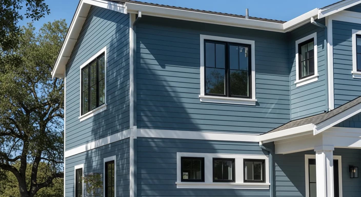
Slate, Boothbay Blue, Evening Blue, and Deep Ocean read calm, architectural, and timeless across foothill and valley light. These are our single most-requested direction. The mid-range slate blues (Boothbay Blue, Evening Blue) hide minor stain variation and dust accumulation well; Deep Ocean and the darker slates command attention but show every detail of installation. Slate works on craftsman, modern farmhouse, transitional, and contemporary architecture — one of the few palettes with broad architectural reach.
Warm whites — Arctic White, Cobble Stone, Khaki Brown's lighter range
Warm whites suit modern farmhouse, craftsman, and Mediterranean architecture and age gracefully. Arctic White is the modern farmhouse default — clean, high-contrast, current. Cobble Stone is the warmer alternative for craftsman and traditional architecture. Both hold up well to California UV; ColorPlus's factory-baked finish prevents the field-paint chalking that you see on aging white homes after five years.
Sage and muted greens — Mountain Sage
Mountain Sage and other muted sages suit foothill, wine-country, and woodland-adjacent homes — they harmonize with surrounding oak and pine rather than fighting them. Sage reads sophisticated without being trendy; it's a confident regional choice that won't date. Works particularly well on craftsman, transitional, and Tahoe mountain modern architecture.
Iron Gray and the dark side — Aged Pewter, Iron Gray, Night Gray
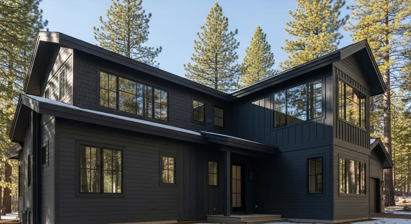
California has historically been a light-color region, but darker grays are gaining ground on modern and modern farmhouse projects. Iron Gray is the most-installed dark tone here — it photographs well, holds detail in shadow, and pairs with both white and warm wood trim. Aged Pewter is the warmer dark option. Night Gray is the boldest commitment — best on contemporary architecture with substantial glass.
Warm earth tones — Khaki Brown, Timber Bark, Monterey Taupe
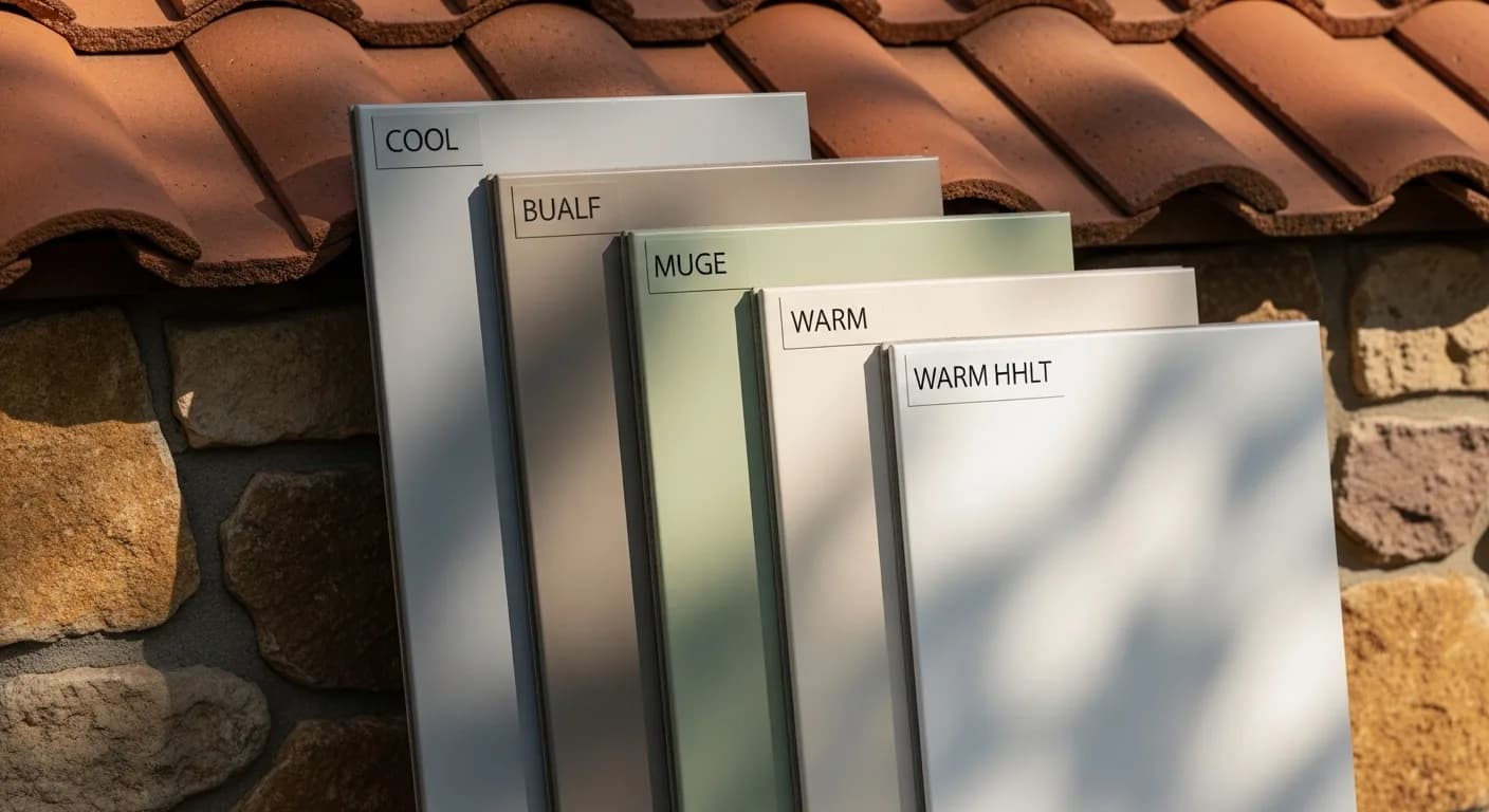
Earth tones suit Mediterranean, Tuscan-influenced, and traditional Sacramento Valley architecture. Less currently fashionable than the gray spectrum but consistently respectful of established neighborhoods. Pair with stone, terra cotta tile roof, or warm wood entry doors. Reads more conservative; ages well.
Color the architecture demands to avoid
Countrylane Red and similar bold accents are visually demanding — they read intentional only on the right architecture (craftsman, period barn-style) and only in specific California regions (apple-country foothills, agricultural Sacramento River homesteads). On wrong-architecture homes they read costume. We'll honestly say so during scoping.
Trim pairing — the multiplier
Right trim doubles the impact of a strong body color; wrong trim cancels it. Arctic White trim with slate body reads classic. Iron Gray body + Arctic White trim + black window frames = current modern. Mountain Sage body + Cobble Stone trim = warm woodland sophistication. Avoid: matching body and trim too closely (loses architectural definition), or overly contrasting trim that fights the body.
Black window frames — the modern accent
Across all the palettes above, swapping aluminum-finish white windows for black fiberglass or aluminum window frames pulls the home into current vocabulary. Particularly powerful on Arctic White, Iron Gray, and Boothbay Blue body. Slightly less impactful on warm earth tones.
Orientation matters
South- and west-facing primary elevations take the most UV and age fastest — choose colors that hold mid-tone (Arctic White, Cobble Stone, Boothbay Blue) for these elevations rather than darkest tones that show fade soonest. North-facing primary elevations can carry darker, more saturated tones (Deep Ocean, Iron Gray, Night Gray) because they hold detail in shaded light and won't UV-stress the same way.
Coastal fog versus inland heat — how microclimate shifts the same color
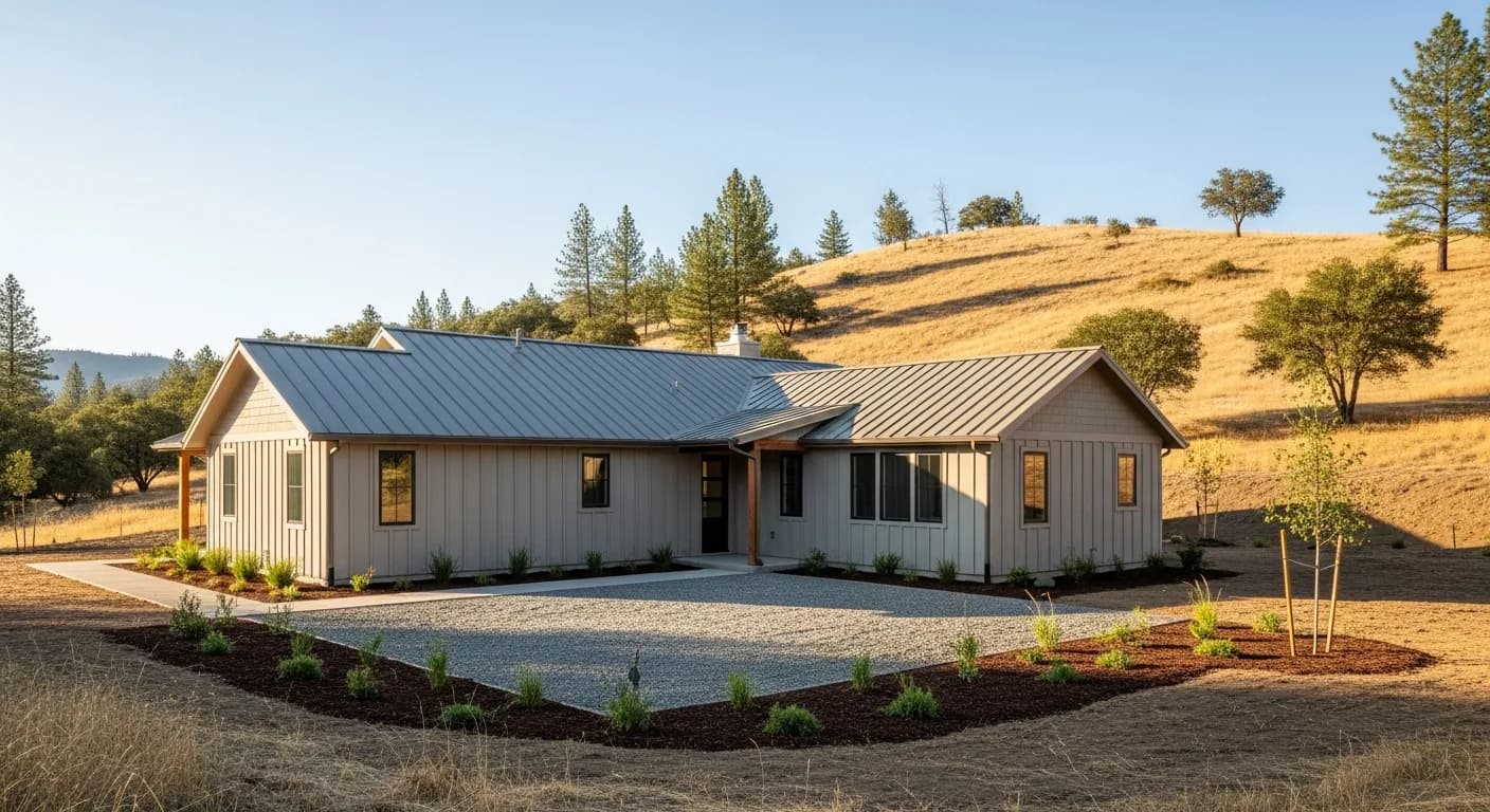
Northern California is not one light condition, and the same ColorPlus tone can land in two different places depending on where the house sits. In the Bay Area's fog belt, marine moisture mutes saturation and pulls cool tones grayer, so a slate that looks crisp in a Sacramento sample can flatten into a dull pewter near the coast. Inland, the dry valley air and relentless summer UV do the opposite, brightening and slightly warming everything while accelerating any fade on lower-grade finishes. The practical takeaway is to test a tone in its destination climate, not the showroom. Foothill homes under heavy oak canopy live in dappled shade much of the day, which favors mid-value colors that hold their identity in shadow rather than washing out. Tahoe's thin, high-altitude air is the most punishing test of all, exaggerating both blues and greens and making off-balance undertones obvious. Because Hardie's baked-on ColorPlus finish carries a much longer fade warranty than field-painted fiber cement, color stability is a real advantage here, but it does not change how a tone reads on day one. If you want the science behind how factory finish resists UV, James Hardie documents it directly at James Hardie. Match the palette to the microclimate before you fall in love with a chip, and see our broader fiber cement siding overview for the substrate reasoning.
Fire-zone color and wildfire-resilient finishes in the foothills
For homes in the Sierra foothills and other high-hazard areas, color choice intersects with fire resilience in ways many buyers overlook. Fiber cement is noncombustible, which is one reason it performs well in wildland-urban interface zones, but the finish and detailing around it still matter. Darker body colors absorb more heat and can show ember scorch or soot more visibly than lighter tones, so in heavy-smoke summers a mid-value or warm-neutral body may stay looking clean longer than a deep charcoal. None of that overrides defensible-space and ember-resistant construction requirements, which are set by code and by your local fire authority, not by paint. Before committing to a darker dramatic palette in a mapped fire zone, confirm what your jurisdiction requires for exterior assemblies; the statewide hazard maps and guidance are published by CAL FIRE. Color also plays a quiet role in heat load: lighter body tones reflect more solar energy and can reduce wall surface temperatures on west-facing elevations during valley heat waves. That ties color selection to comfort and cooling cost, not just curb appeal. If you are weighing how material and finish decisions affect your overall budget in a foothill build, our siding cost in California breakdown puts the trade-offs in context, and any reputable installer should carry verifiable licensing you can check at the Contractors State License Board.
Reading undertones — why two grays never look the same
The single most common color mistake is treating gray as a neutral. Every Hardie gray carries an undertone, and that undertone is what decides whether the finished house feels cohesive or vaguely wrong. Cool grays lean blue or green and pair cleanly with black windows and silvery hardscape, while warmer grays carry a taupe or brown base that flatters wood accents, stone, and copper. When the body undertone fights the fixed elements you cannot change, like a clay-tile roof, a brick chimney, or existing flagstone, the whole elevation reads disjointed. Hold the sample against those permanent materials, not against a white wall, because the white wall lies. Roof color is the biggest constraint most homeowners ignore: a brown or terracotta roof pushes you toward warmer earth tones and away from cool blue-grays, while a charcoal architectural shingle opens the cool-and-dramatic range. The same logic applies to your trim, which should either deliberately contrast or deliberately echo the body undertone rather than landing in an awkward middle. Because undertone shifts with the sun, evaluate every candidate at three different times of day on the actual elevation it will live on. For homeowners deciding between staying neutral and going bold, the safest route is to anchor on undertone family first and value second. When you are ready to translate a palette into a real project, you can request a walkthrough through our estimate request.
Resale, neighborhood fit, and HOA-friendly palettes
Color is partly personal taste and partly a financial decision, especially in California's high-value housing markets where exterior updates show up in appraisals and buyer impressions. Industry tracking on which exterior projects recoup the most value, like the annual Remodeling Cost vs. Value report, consistently shows fiber cement siding among the strongest returns, and a thoughtful, broadly appealing color protects that return. Highly saturated or trend-chasing body colors can date a house and narrow its buyer pool, while restrained slate, warm white, and muted earth palettes age gracefully and read clean in listing photos. Neighborhood context matters too. A color that sings on a hillside contemporary can look out of place on a street of traditional ranches, and buyers register that dissonance even when they cannot name it. If your community has an HOA or architectural review board, get the approved palette in writing before you order, because a rejected color is an expensive mistake to unwind once boards are cut and finished. The smartest approach is to choose a body color that fits in but does not disappear, then earn distinction through trim, door, and accent choices that are cheaper to change later. ColorPlus reduces the long-term risk by holding its tone for years, so the color you approve at resale still reads true. For a fuller view of how material grade and labor shape the number behind these choices, our fiber cement siding overview connects color strategy back to the substrate and budget decisions that frame it.
Key takeaways
- Slate/blue-gray is California's consistent winner across architecture types
- Arctic White is the modern farmhouse default; Cobble Stone is its warmer alternative
- Mountain Sage harmonizes with foothill and woodland surroundings
- Iron Gray leads the dark-color move; Aged Pewter is the warmer dark
- South/west elevations need fade-tolerant mid-tones; north can carry darker
- Always sample on the actual elevation at multiple times of day
FAQ
Quick Answers
Yes — darker tones show fade sooner because UV impact is wavelength-cumulative. ColorPlus factory finish significantly slows it (the through-color and baked-on formulation outperforms field paint), but darker tones on south/west elevations will still show some shift before north-facing ones. Choose dark for north-facing primary; mid-tone or lighter for south/west primary.
Yes — color guidance is part of every Hardie project. We bring physical ColorPlus samples to your home, talk through architecture and neighborhood context, and provide installed sample boards on actual elevations before final commitment. Color is the highest-impact design decision in a re-side; we don't let it go unsupported.
Iron Gray, Aged Pewter, and the slate-blue spectrum have shown 5+ year staying power and pair well with classic palettes — these read as confident classics now, not trends. The very dark contemporary tones (Night Gray, Cinder) are more time-stamped to the 2020s aesthetic and may date faster.
Yes — a single accent color (board-and-batten gable, accent dormer, or gable face) in a darker or contrasting tone elevates the composition. Avoid more than two body colors on a single elevation; the home starts to read busy rather than intentional.
Color choice is unregulated by code but matters in HOA-controlled communities, historic districts, and some Tahoe associations with mountain-character palette restrictions. We check your HOA palette and historic-district requirements before final color commitment.
Sources
Authoritative references
External links to government, code, and manufacturer sources. Sierra Siding is not affiliated with these organizations; references are provided for verification.