
14 min read · Pillar Guide
A premium California exterior rarely comes from one expensive choice — it comes from a handful of deliberate decisions made coherently: profile and reveal, color against regional light, trim weight, window color and proportion, and how materials meet. This guide covers the design decisions that separate a re-side that merely looks new from one that looks designed, while staying durable in California conditions. To see how these decisions read on a finished elevation, browse the exteriors we build.
Design starts with the architecture
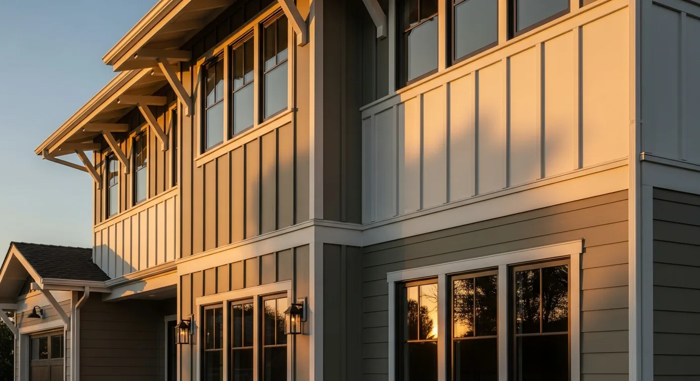
The strongest exteriors amplify the home's existing architecture rather than fight it. A mid-century home wants flat planes and tight reveals; a craftsman wants substantial trim and texture; a farmhouse wants vertical board-and-batten and a crisp palette. The first design question is always 'what is this house trying to be,' not 'what's trending.'
Profile and rhythm
Lap width, board-and-batten spacing, panel modules, and mixed-profile compositions set architectural character. The detail that actually reads as 'designed' is reveal consistency — uniform exposure, aligned joints, and disciplined transitions. Inconsistent reveals are the most common reason an expensive re-side still looks ordinary.
Mixing materials and profiles well
Two or three materials/profiles, deliberately zoned by massing (e.g., board-and-batten on gables, lap on the body, panel on a feature volume), can be powerful. The discipline is restraint and clean transition detailing — random mixing reads as busy. Each change should follow the building's geometry, not decorate it.
Color and California light
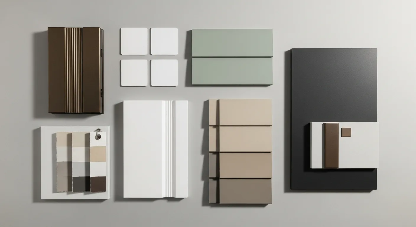
Northern California's bright, slightly cool light favors muted, nature-aligned palettes — slate and blue-grays, sages, warm whites, greiges, and earthy taupes — over saturated or stark tones. Color also interacts with climate: deep colors on full-sun south/west elevations fade and heat-stress fastest unless a strong factory finish supports them (see the Hardie and Sacramento pillars).
Trim as the frame
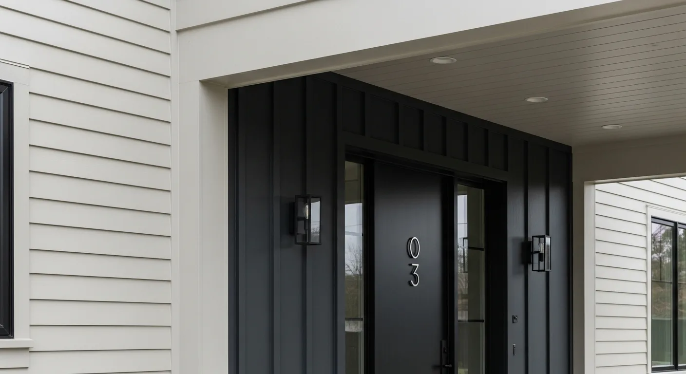
Trim weight and color define the composition the way a frame defines a painting. Crisp contrasting trim (warm white or black) sharpens modern lines; tone-on-tone trim quiets a busy facade. Corner, window, and band trim proportion is a design decision — under-scaled trim is a frequent tell of a value-engineered job.
Windows as design, not just glazing
Black or bronze window frames against muted siding is one of the strongest contemporary looks in the region — but it lives or dies on proportion, alignment, and trim integration. Because correct flashing is only fully achievable with the cladding off, a re-side is the right moment to get window color and proportion right, not a separate afterthought.
Regional style families
Modern farmhouse (vertical batten, crisp white or charcoal, black windows), warm modern (wood-look accents, flat panel, deep neutrals), refined craftsman (substantial trim, sage/earth tones), and clean coastal (soft grays/whites, corrosion-aware metal) each have a coherent California vocabulary. We design within a family rather than collaging features from several.
Designing for durability, not just the photo
A great-looking exterior that ignores the climate fails the design within years. Color stability under UV, profile choices that detail cleanly for water and fire, and finishes matched to exposure are part of design here — aesthetics and the system are the same decision, not competing ones.
Common design mistakes we're asked to fix
The recurring ones: inconsistent reveals, under-scaled trim, too many materials with no massing logic, trend colors that clash with the home's architecture or the regional light, and window color/proportion treated as an afterthought. Most are cheaper to avoid in design than to correct after install.
It's the system, not just the look
As across every guide here: the most beautiful palette over an under-detailed assembly still fails. The best exteriors are where the design intent and the weather/fire system are specified together — which is exactly how we approach an exterior-studio project.
Massing, shadow lines, and the role of depth
Most homeowners think exterior design lives in color and material, but a modern California facade reads first through depth. Shadow lines created by projecting trim, recessed entries, and stepped wall planes give a flat elevation the dimensionality that photographs as architectural rather than builder-grade. A board-and-batten wall with thin battens casts a different shadow than one with substantial three-quarter-inch battens, and that difference is what the eye registers from the curb before it ever processes the paint color. When we plan a re-side, we sketch the elevation in section, not just in plan, because a half-inch of added reveal or a deeper window surround changes how morning and late-afternoon light rake across the wall. California's strong, low-angle coastal and valley light is unusually flattering to depth, which is why builders here can get more design payoff from massing than from expensive cladding. If you are pairing this with material choices, our fiber cement siding page explains which profiles hold a crisp shadow line over decades. The goal is a facade that still looks intentional at noon when shadows flatten, which means depth has to be built into the structure and trim, not borrowed from a single dramatic light condition. A practical test we use on every elevation: imagine the house in flat overcast light and ask whether the composition still has hierarchy. If the design only works at golden hour, it is leaning on the photograph rather than the architecture, and that gap shows the other three hundred days of the year.
Designing the entry as the focal point
Every coherent exterior needs one place the eye lands first, and on most California homes that anchor is the entry. A modern entry is rarely the largest element on the facade; it earns attention through contrast and framing rather than scale. A common move is to wrap the door zone in a different material or a darker color field, then let the rest of the wall recede in a quieter tone. Vertical siding flanking a wide horizontal-lap field signals 'this is the door' without signage. Proportion matters more than size here: a door that is too small for its surround looks lost, while an oversized slab without a frame looks unfinished. Lighting, house numbers, and the porch ceiling material all belong to the entry composition and should be decided together, not bolted on later. We also weigh how the entry meets grade, because a transition that ignores California's drainage and fire-zone clearances will fail inspection even if it photographs beautifully. For homes in higher-risk areas, CAL FIRE maintains defensible-space and ember-resistant material guidance that quietly shapes which entry materials we recommend, especially anything combustible within the first few feet of the wall. The entry is also where sightlines from the street converge, so we check the approach angle: a focal point that only resolves head-on can disappear when the home is seen from a moving car or an angled driveway, which is how most neighbors will actually experience it.
Budgeting design choices that actually move the needle
Not every design upgrade costs the same per dollar of visual impact, and a good plan spends where the eye spends. The highest-return decisions are usually trim weight, window color, and a disciplined two-or-three color palette; these cost little relative to the cladding itself but define whether the home reads as designed. The most expensive decisions, like full material swaps across an entire elevation or custom window shapes, deliver diminishing returns once the basics are coherent. We encourage homeowners to phase: get the profile, reveal, and color right everywhere first, then add accent material at the entry or gables where it counts. National data like the Remodeling Cost vs. Value report consistently shows siding and curb-appeal work recovering a strong share of cost at resale, which makes the design discipline worth the upfront planning. For California-specific figures and what drives the spread between a basic and premium re-side, our siding cost guide breaks down the line items. The mistake we see most is overspending on a statement material while leaving builder-grade trim and stock-white windows in place, which undercuts the whole investment. Coherence is cheaper than luxury, and it photographs better. When a budget is genuinely tight, we steer the dollars toward the front elevation and the most-seen corner return, then carry a simpler, paint-grade detail to the rear where the eye rarely lingers, so the design reads premium where it matters without funding equal effort on facades almost no one studies.
How siding meets the roof, soffit, and grade
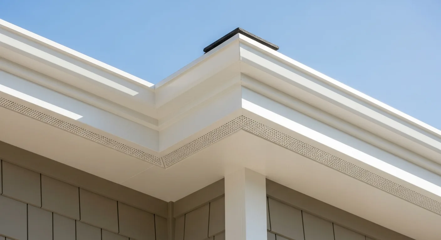
The places where the wall ends are where amateur and professional exteriors diverge most visibly. At the roofline, the relationship between fascia depth, frieze board, and the top course of siding determines whether the eaves look crisp or pinched. A frieze board that is too thin reads as a missing piece; one sized to the fascia gives the cornice authority. At the soffit, the choice between a vented panel and a tongue-and-groove ceiling is both a design and a moisture decision, and in fire-prone zones it is also an ember-intrusion decision. At grade, every cladding system needs a clean termination above soil and a defined drainage gap; siding run too close to the ground wicks moisture and rots regardless of how good the paint looks. California's mix of stucco and lap construction means many re-sides involve transitions between two systems, and a poorly detailed stucco-to-siding joint is a leak waiting to happen. We detail these terminations with flashing and a clear drainage plane before we ever discuss color, because the most beautiful palette fails the moment water finds the wall. Window heads, kick-out flashing at roof-to-wall intersections, and the way trim returns into a corner all belong to this same family of details, and they are exactly the joints inspectors and future buyers' inspectors look at first. When you are ready, you can request a walkthrough of your home's transitions through our estimate request.
Key takeaways
- Amplify the home's architecture — don't collage trends onto it
- Reveal consistency, not material cost, is what reads as 'designed'
- Mix materials by massing logic and restraint, never randomly
- Muted, nature-aligned palettes suit Northern California light
- Trim weight and color frame the whole composition
- Window color and proportion are core design decisions, set during the re-side
- Design and the weather/fire system are one decision, not competing ones
- Most design failures are cheaper to avoid up front than to fix after install
FAQ
Quick Answers
Slate and blue-gray tones, sages, and warm whites/greiges paired with warm-white or black trim remain dominant in modern California exteriors — and they hold up well against the region's light.
Mostly reveal consistency, correctly scaled trim, a coherent palette for the architecture, and resolved window proportion — not how expensive the material is.
Yes, powerfully — but zone the change by the building's massing (e.g., batten on gables, lap on the body) with restraint and clean transitions, rather than mixing randomly.
They're one of the strongest contemporary looks against muted siding; success depends on proportion, alignment, and trim integration — best set during the re-side.
Deep colors on full-sun elevations fade and heat-stress fastest unless a strong factory-baked finish with a fade warranty supports them; otherwise choose a more stable tone.
No — done right they're the same decision. Color stability, water/fire-clean detailing, and exposure-matched finishes are part of the design, not a trade-off against it.
Vertical board-and-batten with a crisp white or charcoal body and black windows, restrained trim, and a coherent neutral palette — designed as one family, not a feature collage.
Yes — design guidance (profile, palette, trim, window pairing) is integral to our exterior-studio approach and is specified together with the weather and fire system.
Sources
Authoritative references
- James Hardie — official product & installation resources
- James Hardie ColorPlus Technology
- CAL FIRE — California Department of Forestry and Fire Protection
- Zonda — 2025 Cost vs. Value Report (exterior remodel ROI)
External links to government, code, and manufacturer sources. Sierra Siding is not affiliated with these organizations; references are provided for verification.